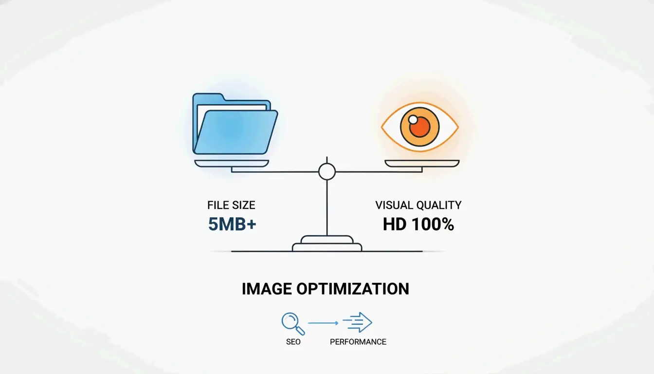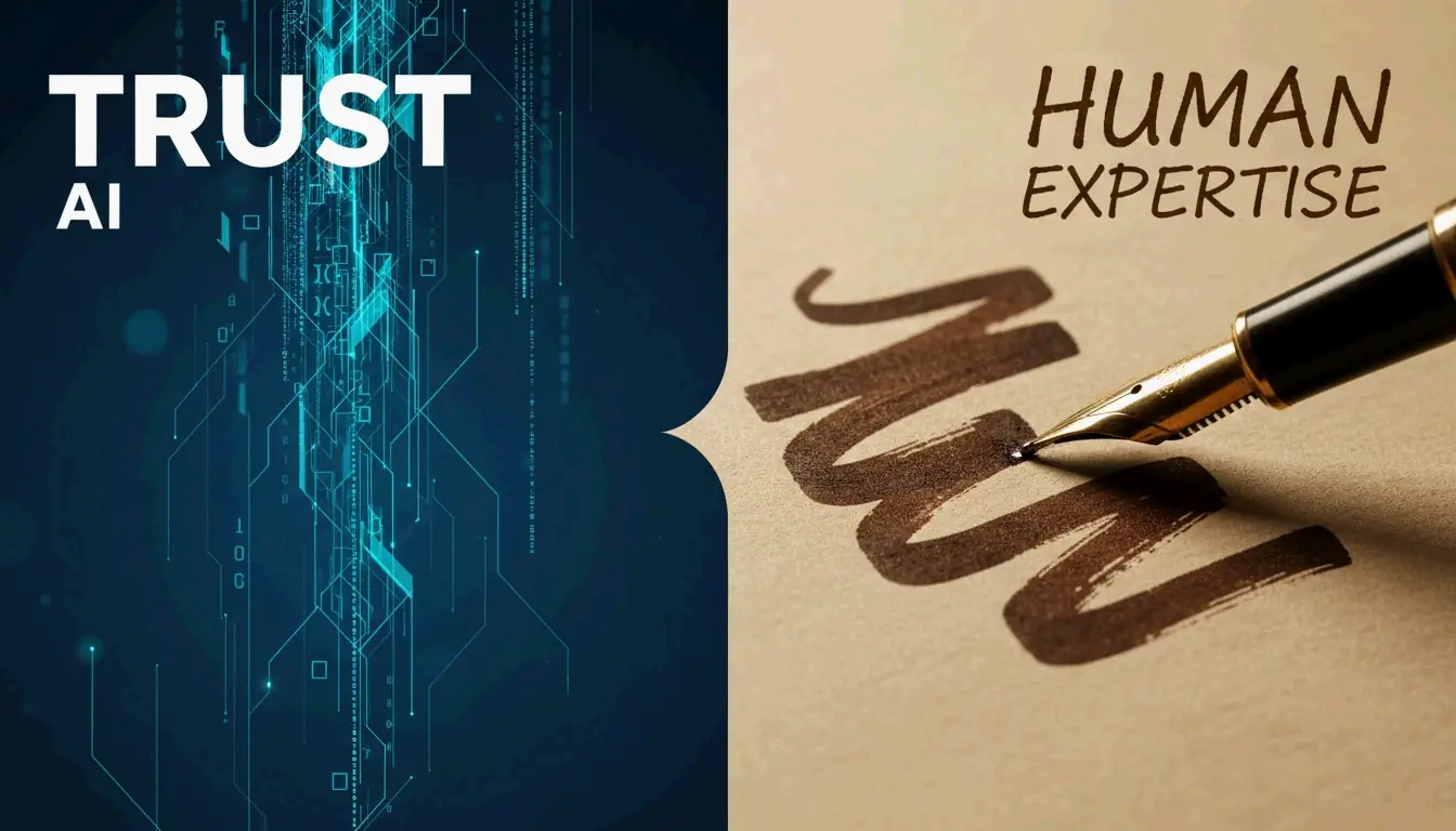
为什么你的内容需要手写感:AI时代的信任信号
2026年,千篇一律的AI内容已成为零成本的商品。要建立信任,你需要人类独有的信号:亲身体验、具体的情境判断和独特的个人声音。数据显示,52%的读者一旦识别出纯AI生成的内容就会停止阅读——这使得真实性成为一种可衡量的商业优势。
信任稀缺:问题背后的数据
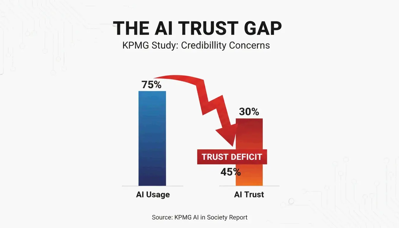
Ahrefs 2025年数据显示,74.2%的新网页包含AI生成的文本。结果是:读者对标准营销文案已经产生了“盲区”。
| 指标 | 数值 | 来源 |
|---|---|---|
| 包含AI文本的网页 | 74.2% | Ahrefs 2025 |
| 经常使用AI的人 | 66% | KPMG 2025 |
| 信任AI输出的人 | 46% | KPMG 2025 |
| 放弃纯AI内容的读者 | 52% | White Beard Strategies 2026 |
使用率(66%)与信任度(46%)之间的差距就是核心问题。当读者发现屏幕背后是一个“机器人”时,他们会立刻贬低作者的可信度。
胜任的平庸:统计均值陷阱
AI模型趋向于统计上的中位数。正如Lilian Makena所指出的,AI抹去了让声音具有辨识度的那些独特韵律和节奏。输出的内容在语法上无可挑剔,却与同一主题的数千篇文章毫无区别。
什么创造了‘手写感’信号?
“手写感”与字体无关。它关乎展示真实人类思维的磨砺——那种只有亲身实践才能产生的证据。
工作证明:信任机制
Jonathan Mast分享了一个案例:一位创始人连续三个月每天发布精修的AI内容。结果:1,200个粉丝,0美元收入。数量有了,但人类证明缺失了。
| 纯AI内容 | 带人类证明的内容 |
|---|---|
| 通用最佳实践 | 具体的失败案例和经验教训 |
| 统计均值的建议 | 来自经验的反直觉观点 |
| 泛泛的示例 | 带有真实结果的第一人称轶事 |
| “安全”的建议 | 带有个人风险的推荐 |
利益攸关审计
在发布之前,问自己:使用相同AI工具的竞争对手能否产出完全一样的文章?如果是,那么你的内容缺少建立信任的人类风险信号。能够建立可信度的内容,创作者必须付出代价——一个有争议的立场、一次坦诚的失误,或一个反直觉的观点。
分层方案:按内容类型平衡人工与AI
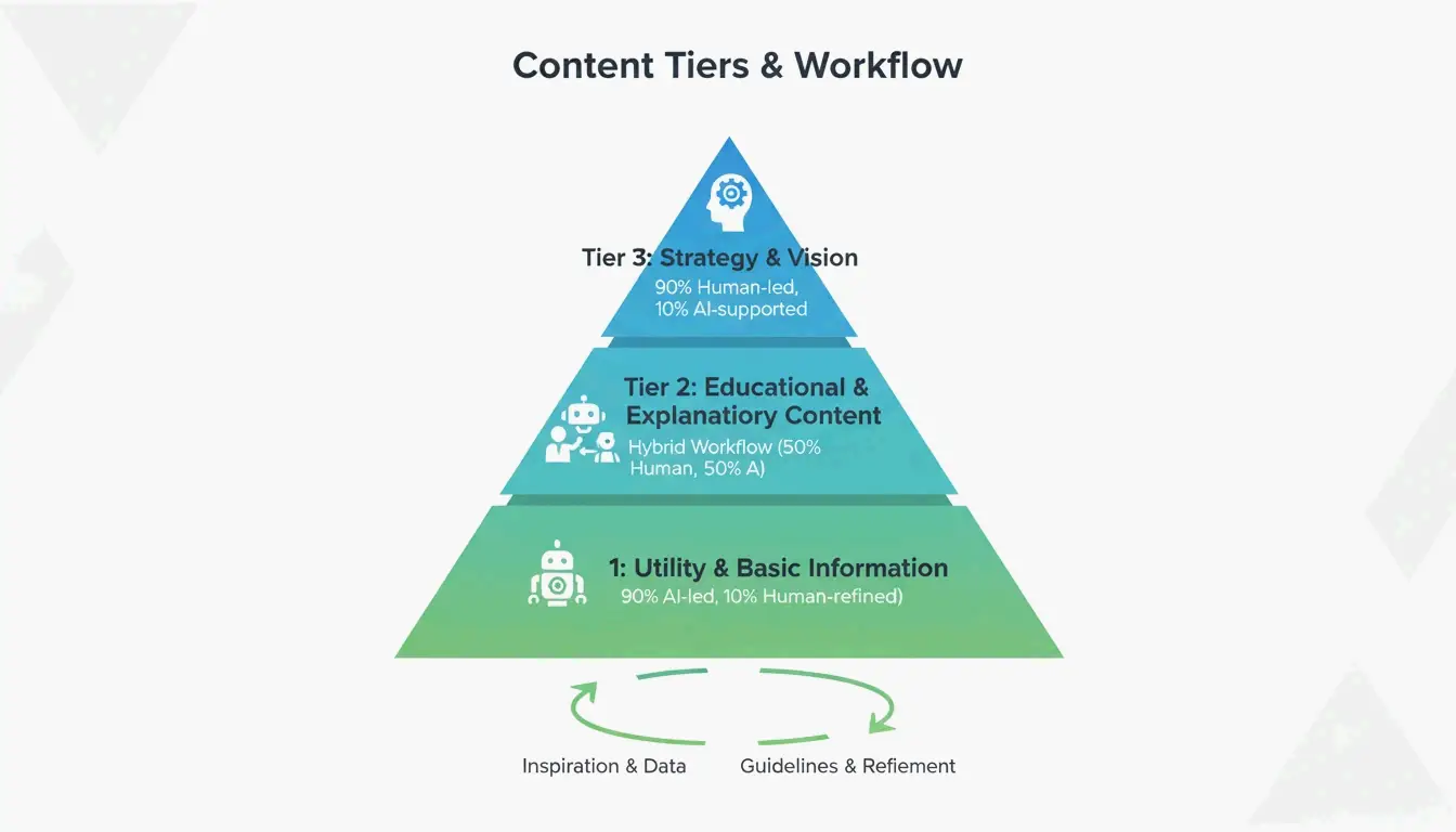
| 层级 | 内容类型 | 人工/AI比例 | 要求 |
|---|---|---|---|
| 第一层 | 战略、观点、思想领导力 | 90%人工主导 | 在AI介入之前确立声音锚点 |
| 第二层 | 教育类操作指南 | 人工主导,AI辅助 | 专家添加真实性信号+真实数据 |
| 第三层 | 产品描述、摘要 | AI主导,人工审核 | 人工检查准确性和品牌语调 |
这种混合工作流让你在不损害高价值内容质量的前提下扩大生产规模,而这些内容正是促成交易的关键。
质量单位成本:真正重要的指标
当文字变得无限且免费时,“每字成本”已经过时。新的指标是质量单位成本——产出真正能转化内容所需的成本。
纯AI内容带来的“信任税”:52%的消费者一旦识别出纯AI输出就会停止阅读(White Beard Strategies)。这导致更少的线索和更长的销售周期。
衡量方法:追踪“轶事归因”——即在销售电话中,潜在客户提及你内容中某个具体故事或独到观点的频率。这直接将信任建设型内容与收入关联起来。
声音锚定:在规模化中保持真实性
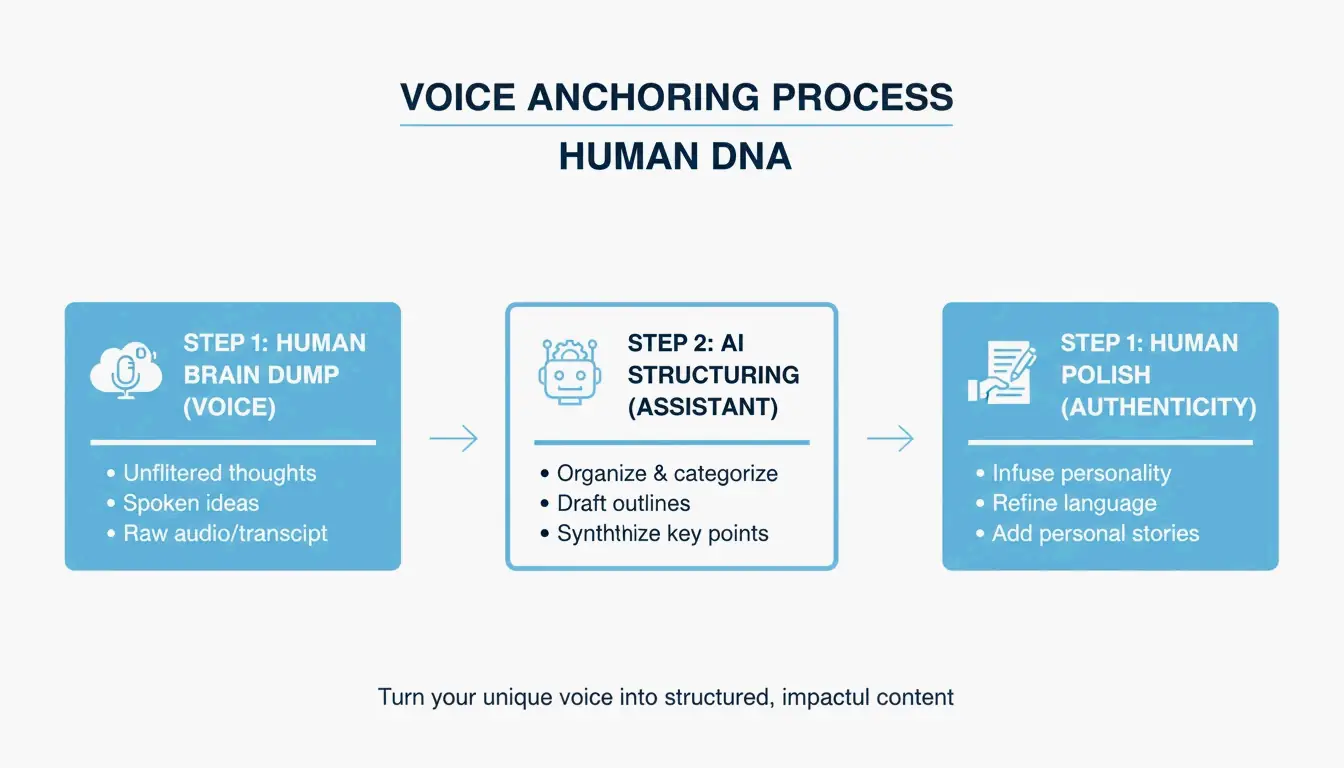
- 录制一段2分钟的“脑暴”,表达你对主题的独特见解(语音转文字或访谈形式)。
- 使用AI作为研究助手来查找支撑数据,或作为格式助手来整理你的思路。
- 保留人类视角作为最终作品的DNA——观点必须来自你自己。
正如Invoke Media所指出的,真实的内容证明你理解客户的具体现实,而非简单重复公开信息。
结论
2026年,你在内容领域唯一的竞争优势就是“手写感”——人类专业知识的真实、具体的生活体验。运用分层方案:将第一层内容保持90%人工主导,使用声音锚定来规模化,并用质量单位成本而非每字成本来衡量效果。
立即行动:审查你阅读量最高的10个页面。在每个页面中找到一段泛泛的、AI味道浓厚的文字,用具体的案例、个人教训或独到观点替换它。
常见问题
我可以训练一个AI人设来模仿我的声音并维持信任吗?
AI可以模仿你的句子结构和词汇,但无法复制亲身体验。用AI来映射你的结构,然后注入一个“人类锚点”——一个只有你知道的故事或具体观察。信任需要AI训练数据中不包含的当下判断力。
如何衡量信任建设型内容与高产量SEO文章的投资回报率?
从“流量”转向“转化意图”和“销售周期长度”。高信任内容带来的访客更少,但线索质量更高,且处于买家旅程的更后阶段。追踪“轶事归因”——即潜在客户在销售电话中引用你内容中具体观点的次数。
2026年搜索引擎和读者会关注哪些真实性标志?
搜索引擎优先考虑“信息增益”——即添加到网络上的、非训练数据中的新见解。读者寻找的是由独特数据或真实照片支撑的“第一人称具体性”(我、我们、我们的)。一个偶尔与AI统计均值相左的一致性观点,是最强的人类专家信号。
SectoJoy
• 独立开发者 & 技术博主我是一名独立开发者,专注于构建 iOS 和 Web 应用程序,致力于打造实用的 SaaS 产品。我擅长 AI SEO,不断探索智能技术如何推动可持续增长和效率提升。